Color Match
- 4.4
- Rating
- 50.00M
- Installs
- Free
- Price

 Analysis by App-foxy
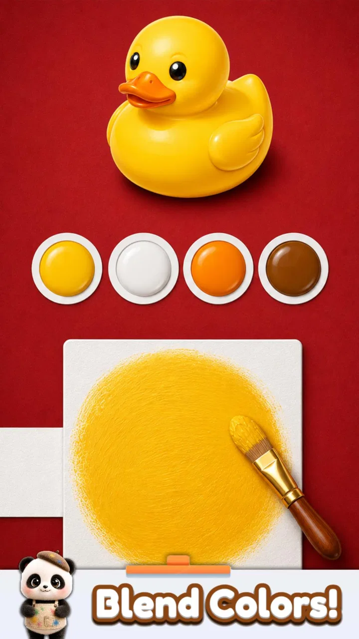
I went into Color Match expecting a simple paint-by-numbers distraction, but its appeal is more hands-on than that. You mix colors on a virtual sheet, compare the result with a target object, and try to get as close as possible. The action is easy to understand within seconds: choose pigment, blend it, inspect the shade, and decide whether another adjustment will improve the match. That small decision is what keeps the game moving.
It is a casual game from Supersonic Studios LTD, available free of charge for players who want short, low-pressure sessions. Its Everyone age rating makes the concept approachable for a broad audience, although the visual judgment involved can still be more satisfying for people who enjoy experimenting rather than simply tapping through levels.
What I like most is that the game turns a familiar creative activity into a compact challenge. There is no need to know color theory before starting, and I never felt punished for taking a moment to look carefully. At the same time, the matching task gives each round a clear purpose, so it feels more focused than an ordinary coloring app.
You May Also Like

 Blood Strike: 2.5 Anniversary
Blood Strike’s Loadouts Turn Every Drop Into a Tactical Gamble
A close look at Blood Strike’s custom loadouts: how fast access to signature weapons reshapes its battle royale rhythm, rewards preparation, and narrows the gap between fights.

 Pandora - Music & Podcasts
Pandora’s Music Is Easy to Start, but Harder to Recover
Pandora’s strength is its low-effort path from a seed to a station. Its weak spot is how much confidence it asks you to place in connection, setup, and quiet recovery.

 8 Ball Pool
 Is Built on Rivalries, Rematches, and Routine
A close look at the rivalries, rematches, shared routines, and unanswered safety questions that turn a quick pool match into a persistent mobile community.

 Samsung Music
’s Quiet Strength Is Playing What You Already Own
Its reach comes less from spectacle than from dependable access to a personal library. That simplicity is both the app’s strongest retention engine and its ceiling.

 AccuWeather: Weather Radar
AccuWeather Review: A Quick, Clear Forecast for Everyday Decisions
For everyday plans, the best forecast is the one you can understand quickly. AccuWeather makes rain timing, radar, and local conditions easy to act on, with a few trade-offs.

 Hill Climb Racing
Why Hill Climb Racing Still Turns Crashes Into One More Run
A tiny car, a bumpy hill and one more upgrade: Hill Climb Racing keeps resurfacing because its simple chaos makes every near-miss feel personal.
More From Our News Desk
View All News


Starting with one color and learning through the first mistake
The first meaningful action is not complicated: I pick a color and place it onto the mixing area. From there, the game asks me to think visually. Is the mixture too warm, too dull, too dark, or simply missing a little of another hue? The answer comes from comparing the blend with the object shown as the target.
That comparison is important because the game does not rely only on the pleasure of making something attractive. A beautiful color can still be the wrong color. I may create a shade that looks pleasing on its own, then realize that it does not sit close enough to the reference. This gives the otherwise simple tapping a small layer of judgment.
I found it useful to resist the urge to add several colors at once. A better workflow is to begin with the dominant color, add a small amount of the likely secondary color, and pause before making another change. That approach makes it easier to understand what each choice did. If I rush, I can move past the target shade and spend more time correcting the mixture than I would have spent building it carefully.
This is one of the game’s less obvious strengths: it rewards observation more than speed. Players who usually skip casual games because they seem mindless may appreciate that each round asks for a tiny visual decision. It is still accessible, but the interaction has enough feedback to make the result feel earned.
Why the comparison matters more than the mixing itself
The mixing action is satisfying, but the real test arrives when I compare the result with the object. That moment gives context to every previous tap. Without it, the game would be little more than a digital palette. With it, the color becomes a hypothesis: I made this shade because I thought it would resemble the target, and now I can see whether that idea worked.
I also noticed that familiar objects can be deceptive. A color that looks obvious in isolation may contain a subtle balance of neighboring tones. Rather than naming the object and assuming I know its color, I get better results by studying the actual reference on the screen. This is a useful habit for younger players, too, because it encourages looking closely instead of relying on a label.
There is a practical way to play when the screen is small or the surrounding light is poor. I make the first blend broad enough to establish the general family, then use the comparison as a guide for refinement. Trying to judge a tiny difference immediately is less reliable than narrowing the range in stages. The game’s simplicity makes this method easy to follow, even without any formal instruction.
That said, the experience is still based on visual perception, so it will not feel equally precise for everyone. If you have difficulty distinguishing nearby shades, the central challenge may become frustrating rather than relaxing. The game does not replace a more open-ended art tool, where personal expression matters more than matching a reference.
Feedback creates a steady rhythm
The core rhythm is clear: act, inspect the result, accept the outcome, and prepare for another attempt. I never need to remember a complicated control scheme. My attention stays on the color and on the distance between my mixture and the target. This makes the game easy to pick up while waiting for a bus, taking a short break, or winding down before bed.
What keeps the feedback loop from feeling completely automatic is the uncertainty before the comparison. I usually have an idea of where the blend is heading, but I do not know whether it will be close enough until the game evaluates it. That small reveal creates the same kind of anticipation found in other quick casual challenges: the action is brief, but the result gives the action meaning.
In my experience, the most enjoyable rounds are not necessarily the ones where I get the closest result immediately. A near miss can be more useful because it shows me which direction to correct. If the shade is too strong in one direction, I can adjust my next mixture with a clearer purpose. The game therefore works best when I treat an imperfect result as information rather than failure.
There is also a nice distinction between playing for accuracy and playing for relaxation. When I want a calm session, I make a reasonable blend and enjoy seeing how it compares. When I want a more engaging challenge, I slow down and try to improve the match by making smaller, more deliberate changes. The same basic interaction supports both moods.
A simple method for getting more consistent matches
I found three habits especially helpful. First, I identify the dominant hue before touching the palette. Second, I consider whether the target looks muted or vivid, because a correct family of color can still feel wrong if its intensity is off. Third, I stop mixing once the result appears close instead of adding one more color out of curiosity.
The third habit matters more than it sounds. Extra adjustments can make a blend less accurate, especially when the current result already resembles the target. In a game built around comparison, restraint is part of the skill. The best move is sometimes to leave a nearly correct mixture alone.
Another useful approach is to compare the mixture from a little distance rather than staring at it continuously. Looking back and forth between the target and the blend helps me notice the overall impression. Constantly focusing on one patch can make small differences seem larger than they are. This is not a hidden mode or a special feature; it is simply a more effective way to use the game’s visual feedback.
That visual focus is also the main limitation of the feedback system. Players looking for sound-driven cues, fast reactions, or a more dramatic response may find the loop quiet. The satisfaction comes from seeing the match improve, not from elaborate action or constant spectacle.
The reward is the match, not just the completion
Color Match gives its reward through the feeling of getting the shade right. The payoff is visual and immediate: I see how my mixture compares with the object, and the result tells me whether my choices were sensible. That is enough to make a successful round feel satisfying without turning the game into a complicated progression system.
I enjoy this kind of reward because it connects directly to the action. I am not completing an unrelated task to earn a decorative prize. I am mixing colors to match an object, and the reward is the confirmation that the mixture worked. That direct connection makes the game easy to understand even when I return after a long break.
The game’s free model also lowers the barrier to trying it. It includes in-app purchases priced from $2.99 to $12.99 per item, so anyone who enjoys the basic loop should remember that optional spending is part of the overall experience. I would start with the free version and decide based on actual play rather than assuming purchases are necessary for the game to be enjoyable.
For me, the best use case is a short mental reset. If I have a few minutes between tasks, a round gives my attention something concrete to do without requiring the commitment of a full puzzle game. It can also work as a gentle activity for someone who likes colors but does not want a demanding drawing application with layers, brushes, and a large toolset.
It is less suitable for players who need a strong long-term goal. The reward is concentrated in the individual round and the pleasure of improving a match. If you prefer character upgrades, a story campaign, competitive rankings, or complex puzzles that build on one another, this will probably feel too narrow.
Who gets the most from this reward loop?
I would recommend it to people who like tactile, visual tasks and want something that can be understood immediately. It is particularly suitable for casual players who enjoy noticing small differences, parents looking for an approachable game with an Everyone rating, and anyone who finds color mixing relaxing but wants a little structure around it.
I would be more cautious about recommending it to someone who wants a true painting experience. The goal is not to create a personal composition or explore unlimited color combinations. The target object defines the direction, so creative freedom is deliberately limited. That constraint is what makes the rounds clear, but it also means the game cannot replace a sketching or digital art app.
It is also not the best choice for a player who dislikes repeating a basic action. The game’s appeal depends on enjoying the cycle of blend, compare, and try again. If that cycle feels repetitive after a few rounds, the attractive presentation will not solve the underlying issue.
Resetting the session is part of the appeal
After a round ends, the reason to continue is simple: the next object presents a fresh color problem. The reset clears away the previous mixture and gives me another chance to apply what I just noticed. I do not need to carry a complicated inventory or remember a long chain of instructions. Each new round feels like a clean slate.
This reset is one reason the game works well in short bursts. I can stop after a single successful match without feeling that I have abandoned a larger commitment. When I return, I can begin again immediately. On the other hand, the same independence between rounds can make the experience feel less substantial during a long session. There is little narrative pressure encouraging me to stay beyond the appeal of the next comparison.
A realistic everyday scenario is a ten-minute break after finishing a routine task. I can open the game, complete several color matches, and close it without needing to reach a checkpoint or protect a complicated run. The activity occupies my attention just enough to interrupt work-related thoughts, while the low complexity keeps it from becoming another demanding obligation.
For children, the reset can make the game approachable because a mistake does not ruin a large project. Each round offers another opportunity to observe and adjust. I would still encourage an adult to play alongside a young child at first, not because the controls are difficult, but because discussing why a shade looks warmer, cooler, lighter, or duller can turn the activity into a more thoughtful exercise.
The reset also exposes the game’s main trade-off. It is convenient precisely because it does not ask much from the player, but that convenience can become sameness. I would not choose it as my only casual game. I would keep it alongside a word puzzle, a more creative coloring tool, or a game with a stronger sense of progression, depending on my mood.
How it compares with ordinary casual alternatives
Compared with a standard coloring app, this game is more goal-driven and less expressive. A coloring app usually lets me choose where to place colors and decide when a picture feels finished. Here, the reference object gives me a narrower task, which makes the experience quicker and more focused but also less personal.
Compared with a traditional matching puzzle, the challenge is less about remembering positions or spotting identical symbols. I am judging relationships between shades, so the game feels slower and more observational. That makes it a better fit for someone who wants a calm visual exercise, but a weaker fit for anyone seeking rapid pattern recognition or strategic planning.
Compared with a full art program, the advantage is immediate accessibility. I do not have to learn a brush system or manage a blank canvas. The disadvantage is that I cannot turn the matching exercise into a finished piece of my own. The choice depends on whether I want to practice visual judgment or make something freely.
Its scale also matters. With over 50 million installs and an average rating of 4.4 from around 547 thousand ratings, it has clearly reached a large casual audience. Those figures suggest that the basic idea connects with many players, but they do not change the personal question: whether I enjoy repeating a focused color-matching loop.
Performance, access, and what to expect before installing
The game supports devices running Android 7.1 or later, and its current version is 3.85. That makes the compatibility requirement relatively approachable for people using older Android hardware, provided the device meets that operating-system baseline. I would still judge the experience on the phone or tablet I plan to use, because color-based play benefits from a screen where nearby shades are easy to distinguish.
It is free to install, which makes testing the central loop straightforward. I would not decide based only on the attractive concept. The important question is whether the first few rounds make me want to refine the next mixture. If the comparison feels satisfying, the game has found its audience. If I want more freedom or a deeper challenge, no amount of additional content would change the fact that the basic interaction is intentionally simple.
The Everyone rating is useful for families considering an uncomplicated casual title, although shared play can be more rewarding when someone talks through the color choices rather than simply taking over. For solo adults, the same accessibility makes it a convenient break-time game instead of a hobby that requires preparation.
The developer, Supersonic Studios LTD, has built the experience around a very clear promise: make a color, compare it, and see how well it works. That clarity is a strength because I always understand what the game wants from me. It is also a boundary, because players hoping for a broad collection of unrelated mechanics may find the design too concentrated.
The game has around 7.7 thousand written reviews alongside its much larger rating total, which gives it a substantial public footprint. I see that as useful context rather than a guarantee that every player will enjoy it. Color perception, patience, and expectations about progression will shape the experience more than popularity alone.
My verdict on the complete action-to-reset loop
Color Match works because every part of its cycle points to the next: I choose a color, blend it, compare the result, receive a clear visual judgment, and decide whether I want another attempt with a new object. The reward is immediate enough to feel satisfying, while the reset is quick enough to make one more round an easy decision.
My strongest recommendation is to play deliberately. Start with the dominant hue, make restrained changes, and use near misses as guidance. That turns the game from random tapping into a small exercise in visual reasoning. It also helps reveal the difference between a color that looks nice and a color that actually matches the reference.
I would recommend it to anyone seeking a free, approachable casual game for short sessions, especially if color experiments sound more appealing than racing, combat, or word puzzles. I would skip it if I need deep progression, broad creative control, or a challenge that changes dramatically from round to round.
After spending time with it, I see the appeal clearly: the game does not try to overwhelm me. It gives me one visual problem, lets me act on an instinct, shows me the consequence, and offers a fresh start. The loop is simple, but the comparison gives every tap a reason. For the right player, that is enough to make another session feel natural rather than forced.
FAQs for Color Match
01What is Color Match and how does it work?
Color Match is an engaging puzzle game where players are challenged to match colors based on given shades. The game provides a palette and a target color, and players adjust the hues to achieve an exact match. It’s a creative way to test and improve your color perception skills while enjoying a relaxing gaming experience.
02Is Color Match free to download and play?
Yes, Color Match is free to download on both Android and iOS platforms. While the core gameplay is accessible without cost, there might be optional in-app purchases available. These purchases can enhance the gameplay experience by offering additional features, levels, or removing ads for uninterrupted play.
03Does Color Match require an internet connection to play?
Color Match does not require an internet connection for its basic gameplay. Players can enjoy the game's offline mode, which is ideal for playing on-the-go. However, some features like leaderboard updates and in-app purchases may need a stable internet connection to function properly.
04What age group is Color Match suitable for?
Color Match is designed for a broad audience and is suitable for players of all ages. Its intuitive interface and straightforward mechanics make it accessible to younger players, while its challenging levels can captivate older audiences, providing a fun and educational experience for everyone.
05Are there any accessibility features in Color Match?
Yes, Color Match includes several accessibility features to accommodate players with different needs. Options like adjustable color contrast, text size settings, and audio cues are available to enhance gameplay for individuals with visual impairments or other accessibility requirements. This ensures a more inclusive gaming experience.
Pros
- Intuitive interface for easy navigation.
- Wide range of color palettes available.
- Customizable color options for creativity.
- Seamless integration with design software.
- Offline mode for uninterrupted use.
Cons
- Limited free features without subscription.
- Occasional crashes on older devices.
- Lacks advanced color theory tutorials.
- No support for Pantone colors.
- Ads can be intrusive during use.

Color Match
Gallery